FLY UK Airline Booking App
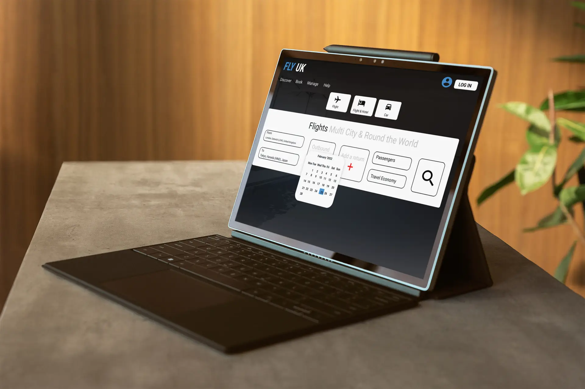
PROBLEM STATEMENT: Booking a flight should be a seamless journey especially if you are a new user using booking app, but instead users seem to get distracted with the clutter of the ads. Frustrated and overwhelmed with the experience.
SOLUTION: FLY UK introduced a clean and intuitive booking flow. Avoid the constraints such as distraction to the eye, unwanted ads and focus on a minimalist design. Searching and booking a flight for a seamless journey based on user feedback.
UX Methodology
I ran through Surveys, gathered user insights to solve user problem
Analysis: Maps these out in post it notes
Design: Customer journey map data analysed, focus on pain points while booking a flight
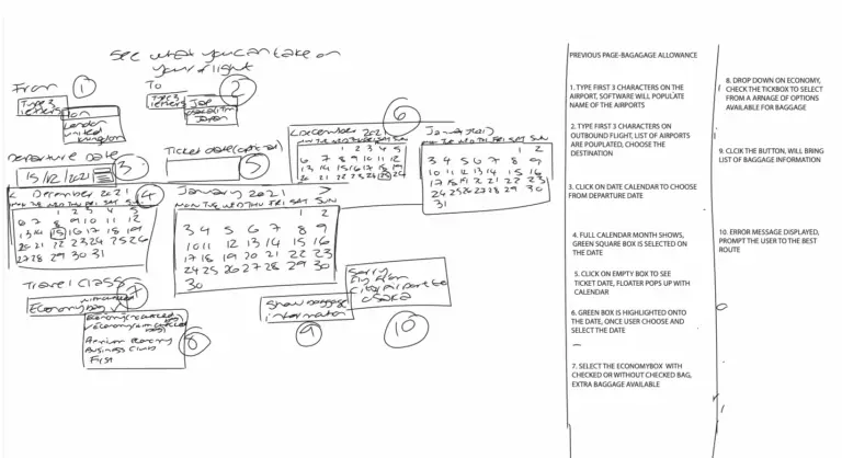
Design low fidelity sketches and a High level detail functional App for cohesive user experience
Issue Validation
I redesigned Call-to-action button which was muted on other competitive websites, bright colour for visibility.
Overview
UX Airline goal is to focus on the UI for clear visibility, avoid constraints in searching for the call-to-action button. User friendly experience booking a flight and locating the search bar is important.
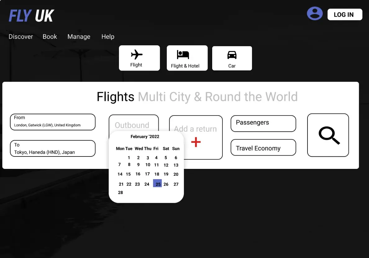
UX Airline has made improvements in terms of layout and clear CTA button,. To enable precise navigation on Airline booking app.
Usability Testing

UX Airline would like to investigate into the user problem!
“The date picker felt confusing — I had to scroll back and forth, and the total price didn’t update correctly.”
“I’d rather speak to a person than type into a chat box.”
“There was an option to see price details, but nothing prompted me to click on it.”
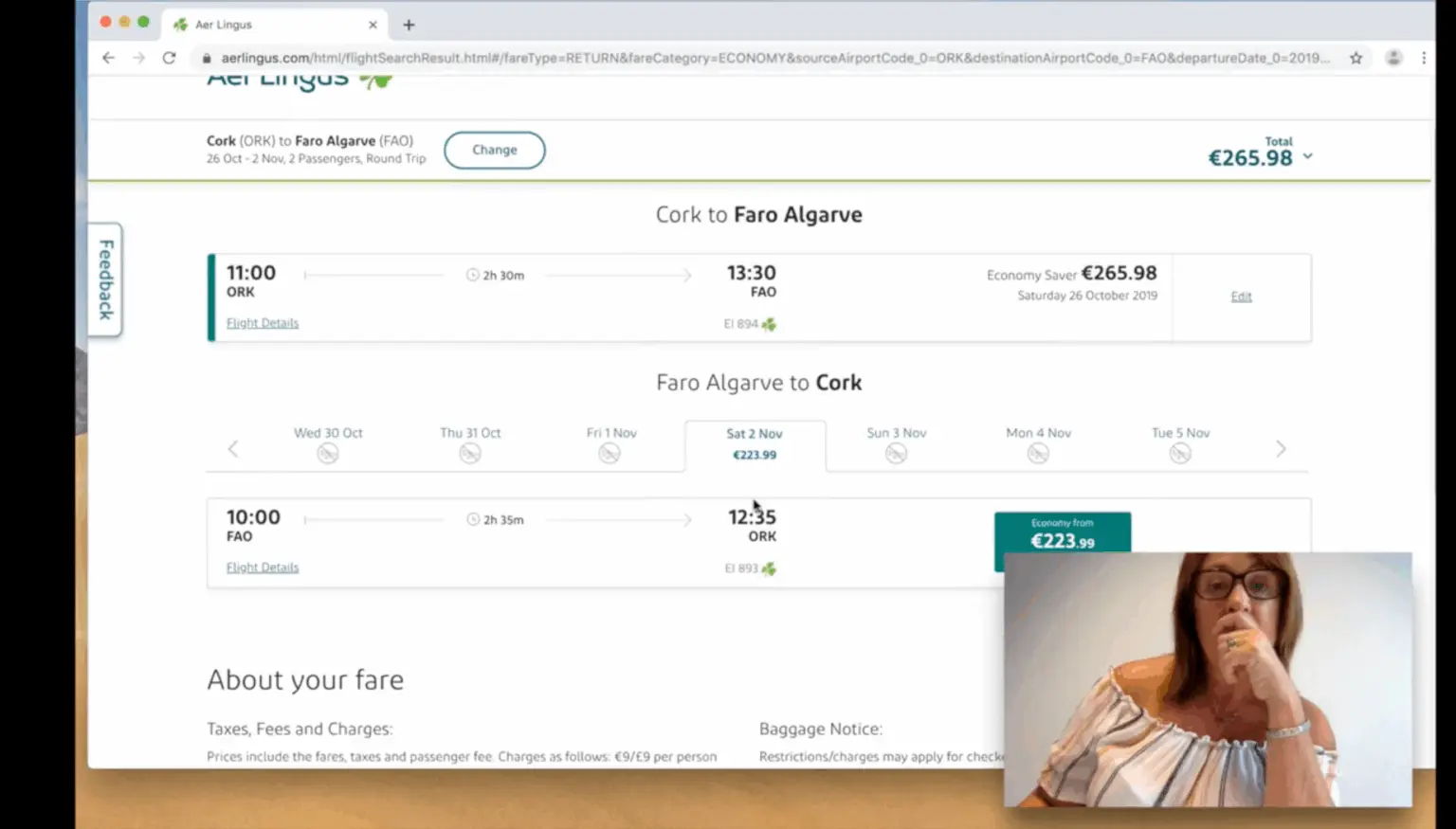
Airport Search Simple and Intuitive
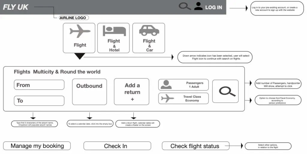
Searching for the right airport should feel less hassle. Typing the first three letters of a city or airport name, users instantly see a smart list of options. With clear hover states and click interactions.
Aggregator wesbites
Users often book flights through platforms like British Airways, Booking.com, or SeatGuru. These websites feel cluttered with ads. Instead of focusing on their trip, they’re distracted and often leave the site. My goal was to design a booking experience that keeps travelers engaged. By creating a clean, focused flow, the airline could build trust and turn more visitors into returning customers.
Qualitative
I ran a user test on the UX Airline site, this was straightforward and easy to navigate, with no confusion. No ads, focused on booking their flight without distractions
Quantatative Research
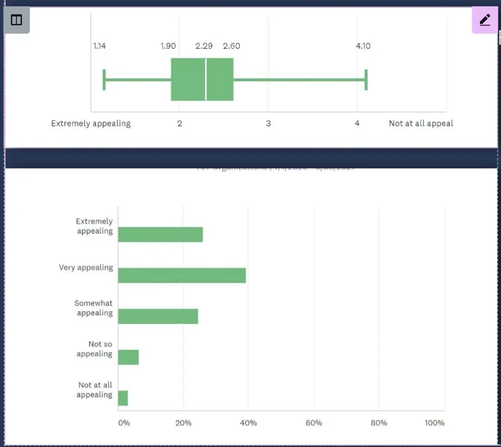
Research Strategy
SURVEY MONKEY
gained a better insight to determine user behaviour while navigation, responsiveness on native apps was the key
-Based on user research findings, the website is appealing
-'Call to action button not visible'
'Brighter colour is preferred'
User testing-Frequently use booking app on smartphone
'How great is the navigation, if I ask myself'
'How simply is it to book a flight' Hover select the whole calendar month, date selection initiates with hight lighted colour
'Flight is self explanatory' 'Flight is non-stop, which is what i like' 'Give me the flight details'
Pain Points
Bright colour created, this is visible according to the consumer eye
User state ‘Distraction on the screen pop up’
User attention is diverted, issue on the health and support page, ‘There is no chat service just directly speaking to a computer’
Clarity on the issue
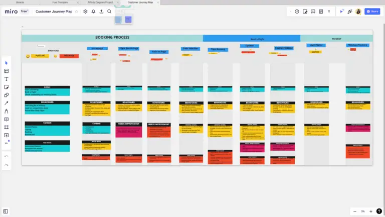
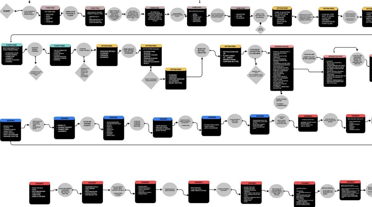
Test these reaction, improvements to be made for a forthcoming product. High level customer journey map step by step instructions on the user reaction how they navigate from one screen to the next, allows the stakeholder to refer to the colour co-ordinated category.
Avoid testing the user, observe their reaction on the software. Navigation around the screen to avoid any constraints
Identify potential problems from goals to pain points
Affinity Diagrams
Post It notes, transformed into Digital

Call to Action Button The search flight button was redesigned in a brighter color, making it stand out, improve overall interface aesthetics Design was clean and avoiding unnecessary advertisements, the experience feels more visually appealing and user-friendly. Card Sorting Research I applied both qualitative and quantitative research methods from benchmarking to usability testing. Using card sorting, I organised user feedback into clear categories of positives and pain points. User Mental Model One tester explained: “Unnecessary pop-ups take over most of the screen. The search flight button should be a different color.” Competitor Benchmarking Many competitor websites lacked clarity and frustrated users, which often caused them to leave the booking process. This insight highlighted the importance of a smoother flow and returned customer to reach business goals.
Customer Journey Map
Destination Selection Enter first 3 letters to see a clear list of airports. Dropdown option available for return flights. Passenger icons and search button are visible and intuitive. Interaction Design Designed to reduce user errors using heuristics. Guided by user interviews to ensure goal-focused. Flexibility Prompts eliminate ambiguity during the start process. Clear guidance in empty fields improves usability. Dropdowns and icons simplify user choices. Prototype & Iteration Responsive high-fidelity prototype built and tested. Iterated based on user feedback to reduce pop-ups and clutter. Minimal color contrast ensures readability and focus.
Book flights with no distractions or ads.
Smart Search: Use the dropdowns to select departure & arrival locations.
Date Picker: Choose your travel dates or full month view.
Account Access: Login with a single click
Optimised Flow: Designed for a linear, seamless process compared to other aggregator sites.
Redesigned Homepage for Clarity and Usability”
Readable UI: Large, chunky text ensures easy readability for all users.
User-Focused Elements: Call-to-action buttons and icons positioned according to user preferences.
Clean & Modern Aesthetics: Minimal bold colors, visually appealing layout, optimised for a contemporary look.
Developer-Ready: Final design validated and ready to move to the development stage.
SOLUTION
Cross-Platform Accessibility: Works on both native and desktop apps.
Smart Interaction: Software intelligently populates empty fields with a single mouse click.
Intuitive Prototype: Stakeholders can interact with the prototype as if it were a real-time app.
Developer Handoff: Next stage involves product developers for full implementation.
Search & Availability: Users can locate search criteria and preferred flights.